|
H35: Visual Assessment of Colour Difference
|
©
James H Nobbs
[Colour4Free]
|
|
|
|
The link between colour
impression and product quality is very strong especially in a prestige
product. It can be expensive to correct the colour of an
off-shade finished product, not just in terms of wasted materials but
also in terms of the time involved. A hidden cost for a
supplier is the loss of the good will of the customer. It is
vital that colour errors are caught early in a production process it
follows that colour control procedures need to present at every stage
of production. Whether the quality control of the colour of a
product is based on instrumental or visual methods, common and agreed
methods of describing differences in colour form an essential part of
all of the following tasks.
|
|
The
description of the colour difference between a trial and a standard.
|
|
|
Giving
the reasons for rejection of the colour of a trial.
|
|
|
Specifying
the changes in colour needed to correct an off-shade material.
|
The most reliable visual
judgement of the colour of a material is made by a direct, side-by-side
comparison of the colour of the test panel with the colour of the
sample panel, as illustrated in Figure 1.
|
There
are a number of factors that influence the decision and need to be
controlled in order to obtain accurate and repeatable evaluations of
the colour difference between a trial and a standard.
Even
under the best conditions, for samples with colour differences typical
for the commercial production of products, an individual observer will
disagree with the decision of the majority of a group of observers
about 17% of the time.
Three
factors need to be considered and controlled;
the presentation of the
test panels;
the viewing conditions;
the observer.
|
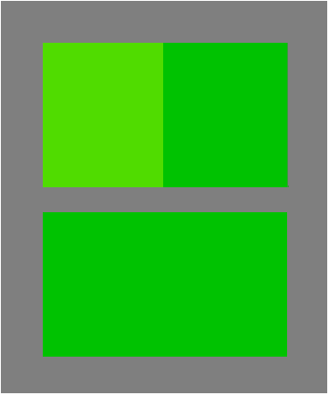
Figure
1: A large colour difference and
a small colour difference
|
Describing
differences in colour
Colour is normally described
in terms of lightness, intensity of the colour sensation and
hue. It follows that to characterise the difference in colour
between a product and a standard, a minimum of one term from each of
the three categories has to be used. For example a full
description of a colour difference would be:
The
trial is lighter, yellower in hue, and more intense (or stronger) than
the standard.
The use of emotional terms
such as warmer or more vibrant is not appropriate since they can mean
something different to each person. In a similar way the use
of industry specific terms, such as cleaner or pasty, should be avoided.
The standard terms that are
most often used for reflective surfaces such as paint, printed paper or
card, plastics and textiles are those used that are also used by the
instrumental method of colour assessment, based on the CIE L* a* b*
equation. These terms are a description of the visual colour
sensation only in, these terms are known as colorimetric
terms.
|
|
Colorimetric terms
|
Terms
that refer to the visual sensation created by a coloured surface.
|
Visual
assessments of colour difference are often given in industry specific
terms that tend to describe the way colours are created or adjusted by
mixing pigments, dyes, inks or paints together, these terms are known
as colourists’ terms.
|
|
Colourists’ terms
|
Practical terms based
on the way the appearance of a coloured material changes with
alterations in the mix of colorants.
|
By
adopting the colorimetric terms for both visual and instrumental
methods, a comparison between visual and instrumental decisions becomes
straightforward.
Graphic
images
The
judgement of the colour quality of graphic images is more difficult to
assess. Usually the pass-fail decision is based on the
overall impression from the image rather than any one specific coloured
area.
A common
method of visual judgement is to agree a standard print and a series of
prints that represent the limits of acceptability along the colour
change types. An example of this approach is shown in Figure
2, where a lighter print limit and a darker print limit is provided as
well as the standard print.
|
Figure 2: Limits of acceptable
product colour
|
Panel
presentation
Panel
size
Where possible it should be
arranged for the trial panel and the standard panel to be of sufficient
size for the image to cover an area on the retina equivalent to the 10°
degree standard observer area. A square panel of side 5.0 cm
(2 inches) viewed from a distance of about 50cm satisfies this
condition.
It is important that the
trial panel and the standard panel are the same size. When
this is not the case then the panels should be viewed through a mask
made from mid-grey card ( 40 < L* < 60) with a
hole cut in the card so that equal areas of trial and standard are
visible.
Explanation: The mixture of light sensitive
cells changes and the light filtering effects of the overlying layers
changes with the position in the retina.
Panel
separation
|
The
most sensitive test of colour difference is when the trial panel and
the standard panel are next to each other, in edge-edge contact.
Explanation: The slightest gap between the
edges, even as little as 1mm, will increase the visible threshold of
colour difference but up to 50%, as illustrated by Figure 3.
|
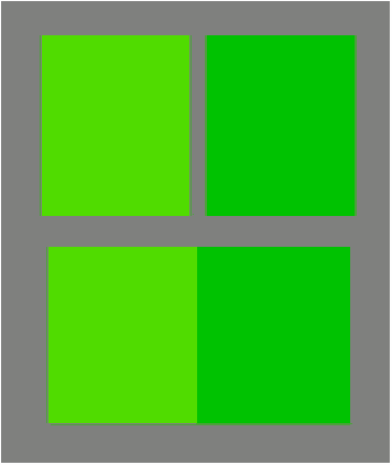
Figure 3: A gap reduces the
visual
sensitivity to colour difference
|
Panel
position
The standard panel should
always be placed on the same side relative to the standard panel.
Placing the standard panel on
the left-hand-side and the trial panel on the right-hand-side is the
most convenient arrangement, especially when a series of trials are
being judged against the same standard. Most people are right
handed and this arrangement allows the right hand to be used to place
the trials in position and to remove them.
Explanation: The colour response of the left
eye is not necessarily identical to that of the right eye.
Swapping the positions of the panels may lead to a change in the
decision.
Illumination type, and level
Type
The panels should be viewed
under lamps that provide a good simulation of the CIE standard
illuminants. Normal practice is to make judgements under:
|
|
A daylight illuminant
D65, however the graphics industry normally uses D50;
|
|
|
The illuminant under
which the illuminant will normally be viewed, such as warm white
fluorescent (home) or cool white fluorescent (office or factory);
|
|
|
At least one other
illuminant with a very different type of spectral distribution, such as
illuminant A.
|
Explanation: Choosing to view the panels using
a simulated CIE Standard Illuminant will allow the visual decisions to
be directly compared with the instrumental measures of colour
difference.
Examination under three
different types of illuminant will allow the colour constancy of the
trial panel and the degree of metamerism between the trial and the
standard to be judged.
Level
The illumination level should
be of order 1000 lux, equivalent to a brightly lit room.
Explanation: The illumination level must be sufficient
for only the cone type cells in the retina to be active, photopic
vision.
Background and surround
Background
The standard and trial panels
should be viewed against a mid-grey background (40 < L* <
60).
Explanation:
The colour of the
immediate background has an influence on the impression of items of
interest; this is clearly demonstrated by the simultaneous contrast
effect. By keeping the background as a neutral grey, the
extent of the effect will be the same each time the panels are viewed.
Surroundings
The surroundings of the room
or area in which the viewing judgements are carried out should not
contain large areas of strong colour.
Explanation: The visual system becomes adapted to the
average nature of the light in the visual field. Strongly
coloured walls and other decoration will influence the state of
adaptation of the visual system.
Light cabinets
Many of the conditions are
achieved most simply by purchase and use of a suitable light
cabinet. There are a number of different types of cabinet
available, each type designed for a different type of sample.
|
The
figures illustrate three types of cabinet produced by the Verivide
company, having:
a
curved viewing area (Figure 4);
a
45° tilted viewing area (Figure 5);
a
flat viewing area (Figure 6).
|
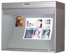
Figure 4: Light cabinet suitable
for graphics
|
|
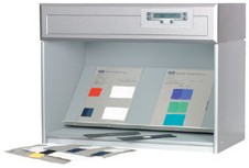
Figure 5: Light cabinet suitable
for flat panels
|
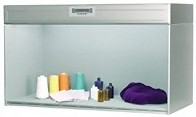
Figure 6: Light cabinet suitable
for 3d objects
|
There are some obvious
housekeeping rules for the correct use of light cabinets.
|
|
The
cabinet should be positioned away from large windows or sources of
bright light in order to avoid light spilling into the cabinet from the
surroundings.
|
|
|
The
viewing area should be keep clear of clutter such as old samples,
instruction books and so on.
|
|
|
The
lamps surfaces or the light diffuser in the luminaire should be
regularly checked for dust and cleaned when required.
|
|
|
The
lamps should be replaced at the recommended intervals.
|
Observer
In an ideal situation, the
people making visual judgements of colour quality will have normal
colour vision and superior ability at discriminating between
colours. If possible, their colour vision should be tested at
least annually using for example the Ishihara test or the more
elaborate Munsell-Farnsworth hundred-hue test.
It is important to recognise
that strong medications and recreational drugs can change the nature of
our colour vision, as can physical injury such as bang on the head.
Finally, and I hope
obviously, a person making colour judgements should not be wearing
sunglasses, tinted spectacles or tinted contact lenses of any sort
Nature of the colour pass-fail decision
It is generally accepted that
there are two distinct types of pass-fail judgement and these are known
as an “acceptability
decision” and as a “perceptibility decision ”.
Perceptibility
A perceptibility decision is
the simpler of the two; a choice is made between two options
|
Option
1
|
The
colour of the trial is a visual match to the colour of the standard
There
is no visible difference in colour between the trial and the standard.
|
|
Option
2
|
The
colour of the trial does not match the colour of the standard
There
is a visible difference in colour between the trial and the standard.
|
When these types of decision
are being made then it should not matter which type of material is
being judged or whether a customer or a supplier is making the judgment.
Acceptability
An acceptability decision is
the type that is normally made when judging the colour quality of
commercial products, either by a customer or by a supplier. A
choice is made between three options.
|
Option
1
|
The
trial colour is a visual match to the colour of the standard
There
is no visible difference in colour between the trial and the standard.
|
|
Option
2
|
The
trial colour is an acceptable match to the colour of the standard
There
is a visible difference in colour between the trial and the standard
and the difference is judged to be small enough for the trial to be
accepted as a colour match to the standard.
|
|
Option
3
|
The
trial colour does not match the colour of the standard
There is a visible
difference in colour between the trial and the standard and the
difference is judged to be large enough for the trial not to be
accepted as a colour match to the standard.
|
The upper limit in colour
difference that is judged to be acceptable will depend on the product
being considered. The limit will be close to the threshold of
visible colour difference for the automotive industry, whereas the
limit for a disposable item of low value, such as food packaging, could
be two or three times greater than the visible threshold.
Determining the “correct decision”
There is little likelihood of
disagreement between observers when the colour of the trial and of the
standard are very different from each other (dE* ≥
5.0). Nearly everyone will agree that the “trial colour does
not match the colour of the standard”, upper pair in Figure 1.
Similarly, when the trial and
standard are virtually identical in colour (dE* ≤
0.5), nearly everyone will agree that the “trial colour is a visual
match to the colour of the standard”, lower pair in Figure 1.
When the colour difference
between the trial and the standard is near the boundary of the visible
threshold
(0.8 < dE* < 2.0),
then the observers will not agree in their judgements. The
correct decision of whether the colour of a trial panel matches the
colour of the standard is the majority decision of a large group of
observers. For example if there are 5 judgements that the
trial matches a standard and 7 judgements that they do not match, then
the correct (majority) decision is that the trial does not match the colour of the standard. In this
example 5 out of 12 judgements (42%) disagreed with the majority
decision, there were the 42% “wrong” decisions.
Threshold of visible colour difference
There is a characteristic
relationship between the colour difference stimulus and the probability
of deciding the colours do not match (Reject) as is illustrated in
Figure 7.
|
When
the colour difference stimulus is high then the probability of a
“Reject” decision is over 0.9. When the colour difference
stimulus is low then the probability of a “Reject” decision of less
than 0.1. Half way between the two is the point of maximum
argument where half of the decisions will be “Reject” and half of the
decisions will be accept.
The
stimulus at which this “50% : 50%” split in decisions occurs is defined
as the visible colour difference threshold.
|
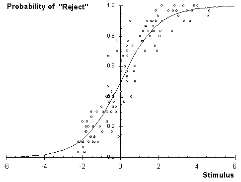
Figure 7: Stimulus response
chart for colour difference decisions
|
|
|
|
|
H35: Visual Assessment of Colour Difference
|
©
James H Nobbs
[Colour4Free]
|