|
H30: Specification of Colour, Munsell and NCS |
© James H Nobbs |
|
|
|
You may be wondering why methods of colour specification are needed when we have such a complex and sensitive system of colour appreciation built into our heads. On the other hand, if you have ever tried to buy an item to match something else, which you don’t have with you at the time, you will know why colour specification is important. Our colour memory is quite poor, and verbal colour communication is no better (how many shades of “navy blue” can you imagine?). Add to these the problem of the relatively high frequency of colour vision deficiency and the case for standardised methods of colour specification is clear.
A formal specification of colour is important in the protection of intellectual property such as design copyright or the colours used in a trademark. We are all familiar with Coca Cola Red and Kodak Yellow. In the UK:
|
|
the company “Cadbury’s” have successfully registered the colour purple (Pantone 2685C) for use in packaging for chocolate; the “AA” has the exclusive right to use recovery and repair vehicles painted yellow (Pantone 109C); the company “Orange” has registered Pantone 151C in the UK for telecoms services, telephones and pagers. |
Disputes can arise, for example the company “Orange” is in dispute with the airline company “EasyGroup” who have applied to register Pantone 021C, a similar shade of orange to Pantone 151C, in respect of a host of services.
It is unfortunate that the accepted method of colour specification in these examples is the Pantone system, since Pantone is neither a national nor an international standard method of specifying colour. An example of good practice is shown in Figure 1 where the London Underground specifications of acceptable colours for the corporate roundel are given in a number of systems, including an international standard method (NCS).
There are many ways of specifying the colour appearance of an object or a surface. The most useful methods are those that do not lead to confusion and where the method has a clear interpretation. In this section we will be looking at the way that colours can be specified by selecting samples from a colour atlas which forms part of a colour order system.
Colour order systems
A colour order system is a rational method or a plan of ordering and specifying object colours. The associated colour atlas provides a set of material standards selected from the order system to represent the whole gamut of object colours.
|
Advantages: |
An easy concept to understand. It is possible for a person to colour match with a standard and a trial side by side, without the need for complex instruction or complex instrumentation. |
|
Drawbacks: |
There
are only a limited number of samples in an atlas. This leads
to large differences between the colours of neighbouring samples.
|
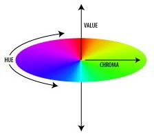
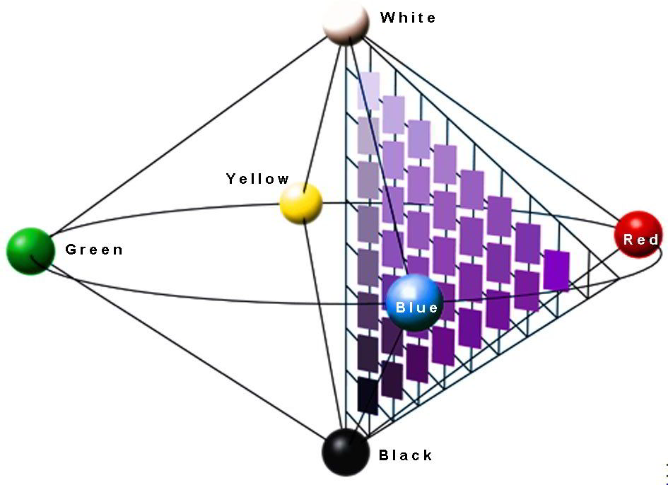
Most colour order systems are based on the arrangement devised by Sigrid Aron Forsius, a Swedish monk and astronomer who, in 1611, suggested a central vertical axis displaying neutral shades from white to black. The central axis is surround by the hues arranged in a circle.
In 1905 the north-American artist Albert H. Munsell suggested a form of colour notation as an aid to artists in the selection and use of colour. The associated colour atlas was produced in 1915.
The system has been accepted as an international standard method for the specification of colour.
The rules of the system are:
|
a. |
Hue, chroma and lightness are ordered according to the Forsius arrangement, Figure 2. |
Figure 2: Munsell hue, value and chroma |
|
b. |
Hue circle is arranged so that mixing together two paints with hues on opposite sides of the hue circle can form a neutral grey. |
|
|
c. |
There are equal distances represent equal visual steps of colour within the lightness scale, within the chroma scale and around an arc of the hue circle. |
The colour of the panel associated with each code in the atlas was determined by visual assessment by a large number of observers.
|
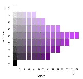
Typical notation A typical notation for a colour is 7.5YR 7/12 and this code represents the colour shown in Figure 3.
The notation 7.5YR 7/12 has the sequence; Hue then Value then Chroma |
Figure 3: 7.5YR 7/12 |
|
|
Hue (7.5YR): |
The hues arranged in a circle in clockwise order: red, yellow, green, blue, purple and red. |
|
|
Value (7): |
To
represent lightness:
|
|
|
Chroma(12): |
To represent the
intensity of the colour:
|
|
In order to satisfy
rule b, Munsell used
Red, Yellow, Green, Blue, Purple
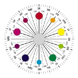
Principle hues The principle hues are arranged in clockwise sequence around a circle as shown in Figure 4. Pure red has the hue code 5R Pure yellow has the hue code (5Y) Pure green has the hue code (5G) Pure blue has the hue code (5B) Pure purple has the hue code (5P) |
Figure 4: The Munsell hue circle |
Intermediate hues
Opposite each principal hue on the circle is an intermediate hue. The intermediate hues are
|
|
yellow-red (5YR), |
green-yellow (5GY), |
|
|
blue-green (5BG), |
purple-blue (5PB) |
|
|
and |
red-purple (5RP). |
The sequence is shown in Figure 4.
|
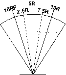
There are 10 hue steps associated with the each primary hue. For example, 5R representing pure red, 2.5R representing a purple shade red and 7.5 R representing a yellow shade red, as shown in Figure 5.
There are 10 hue steps associated with each intermediate hue with 5YR representing the intermediate hue that has an equal balance between the yellowness and the redness characteristics of the shade. |
Figure 5: Part of the hue circle |
|
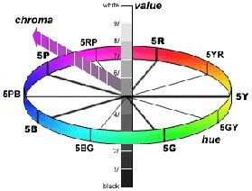
The Value axis is normal to the hue plane, as shown in Figure 6.
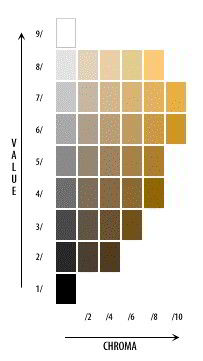
There are 10 steps in the Value scale, starting with pure black at 0 N, through a series of greys to pure white at 10 N.
Representative panels from the Munsell grey scale, are 9N white, 7N light grey, 5N mid grey, 3N dark grey and 1N black. |
Figure 6: Munsell hue, Value and Chroma |
Munsell Chroma (intensity of colour)
The Chroma is a measure of the intensity of the colour sensation. Neutral grey panels have zero chroma and colour intensity increases as the panel move further away from the neutral axis, as shown in Figure 6.
There is not a fixed upper limit to Chroma, the maximum value that can be achieved for a hue depends on the optical properties of the colorants used in the panel. For example, in the current atlas the fullest colour for 5RP has a chroma of 26, yet the fullest colour for 10 YR has a chroma of 10 (Figure 7).
The positions of the steps of the Value scale were intended to be perceptually uniform and were decided by observer judgements. The results of measurement of the panels representing the Value scale formed the basis of the relationship between L* and Y used by the CIE L* a* b* (1976) colour space.
The scaling of unit step in Chroma is not visually the same as the scaling of unit step in Value. The system is defined to have:
1 unit of Value ≈ 2 units of Chroma
The relative size of the hue step depends on the Chroma of the panel. At a Chroma of 5:
1 unit of value ≈ 3 units of Hue
|
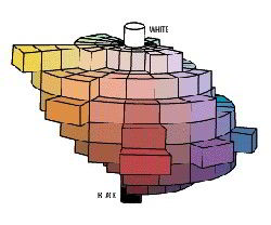
The different levels of colour intensity that can be achieved at each hue produce a very asymmetrical shape to the samples in the colour atlas. The shape is illustrated in Figure 8. |
Figure 8: Munsell colour solid |
The Swedish Colour Foundation established the Natural Colour System in 1972. The representation of the NCS notation in CIE co-ordinates was defined in 1983 by a Swedish national standard.
The rules of the NCS ordering the system are:
|
a. |
Lightness, intensity of colour and hue ordered according to the Forsius arrangement. |
|
b. |
The primary hues are arranged according to the opponent theory of colour vision. |
|
c. |
The spacing of the codes is determined by visual assessment by a large number of observers. |
The notation describes how close a shade resembles the characteristics of six elemental appearance properties.
NCS elemental appearance properties
|
Four |
elemental hues Yellow
(Y), Red (R), Blue (B) and Green (G)
|
|
Two |
elemental colours of White (W) and Black (S) represent the lightness quality on an axis normal to the hue. |
|
The six elemental colour attributes are imagined to be arranged in space to form a double cone, as shown in Figure 9.
All surface colours can be placed in this three-dimensional model and thus be given an exact NCS notation. A typical notation is 2030 Y90R.
In order to understand the NCS notation, the double cone is divided into two parts. |
Figure 9: Arrangement of the six elemental colours |
The notation 2030 locates the blackness and chromaticness of the sample within the NCS colour triangle, a radial plane that is normal to the hue circle and contains colours with the same hue, as shown in Figure 11.
The notation Y90R identifies the hue of the sample within the NCS hue circle, a horizontal plane showing samples with the same whiteness (or blackness), as shown in Figure 10.
The notation has the sequence;
blackness then chromaticness then hue. For example 2030 Y90R
|
|
Blackness (20): |
The degree of difference from the lightest shade that has the same hue and chromaticness |
|
|
Chromaticness (30): |
The intensity of the colour sensation |
|
|
Hue (Y90R): |
The hues arranged in a circle in clockwise order: yellow, red, blue green. |
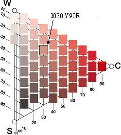
NCS colour triangle, e .g. 2030
The first part the NCS notation describes the independent attributes of blackness(s) and chromaticness(c) of the shade. The scales of chromaticness (C) and of blackness (S) have the range of 0 to 100.
The codes form an equilateral triangle with the corners being pure white (W) at the top, pure black (S) at the bottom and the perfect chromatic colour at the side, as shown in Figure 10. The triangle shape arises as a consequence of the rule that the combined attributes of chromaticness, whiteness and blackness add up to exactly 100.
C + S + W = 100
Since the sum of the attributes adds to 100, it is only necessary to quote two of the attributes. The two attributes chosen were blackness and chromaticness. The third attribute, whiteness, is easily obtained by the difference of the sum of the other 2 from 100,
W = 100 - (C + S).
The concept of blackness has already been established, what can be confusing is the way in which blackness is represented on the NCS triangle. Shades with equal blackness form a series of straight lines parallel to the line joining the pure white point W and the pure chromatic point C. The lines are indicated by the markers on the left-hand edge of the triangle shown in Figure 10.
NCS Chromaticness (30)
The chromaticness is used to indicate the intensity of the colour. The most visually intense shade of a surface colour is defined to have a chromaticness of 100 and a blackness of 0 (and a whiteness of 0).
|
A slightly less intense shade of the same hue may have a chromaticness of 80, for example. The lightest possible shade with that intensity of colour has a whiteness value of 20 and a blackness value of 0. The darkest possible shade with that intensity of colour has a whiteness value of 0 and a blackness value of 20. Don't forget that the sum of the three attributes always adds to 100.
Shades with equal chromaticness form a series of vertical columns in the NCS colour triangle. The equal chromaticness lines are indicated by the markers on the bottom, right hand edge of the triangle in Figure 10. |
Figure 10: NCS Colour Triangle, hue page Y90R |
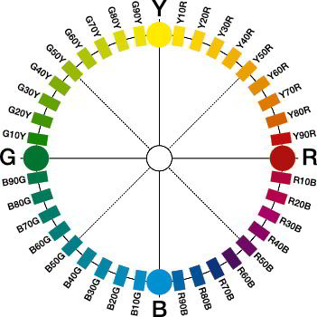
NCS hue circle e.g. Y90R
The four primary colours are arranged clockwise in the sequence yellow, red, blue and green. The NCS atlas contains pages at 40 hue divisions, around the hue circle. Each quadrant between the primary hues being represented by 10 pages in the atlas, as shown in Figure 11.
|
The hue of a shade is characterised by the relative amounts of the two primaries hues that make up the colour. Thus in the red to blue quadrant the hue code R7OB refers to a hue with a 30% resemblance to pure red, and a 70% resemblance to pure blue, as shown in Figure 11.
Note that the hues in the notation are quoted in the clockwise order as shown in Figure 11. The sequence of hues is similar to the CIE L* a* b* arrangement. Y is before R, R is before B, B is before G and G is before Y It follows that Y50R is an NCS hue code, but R50Y is not. |
Figure 11: NCS Colour (Hue) Circle |
|
|
|
|
H30: Specification of Colour, Munsell and NCS |
© James H Nobbs |